# ETL
library(tidyverse)54 shiny app DRP example
Upload libraries
55 Introduction
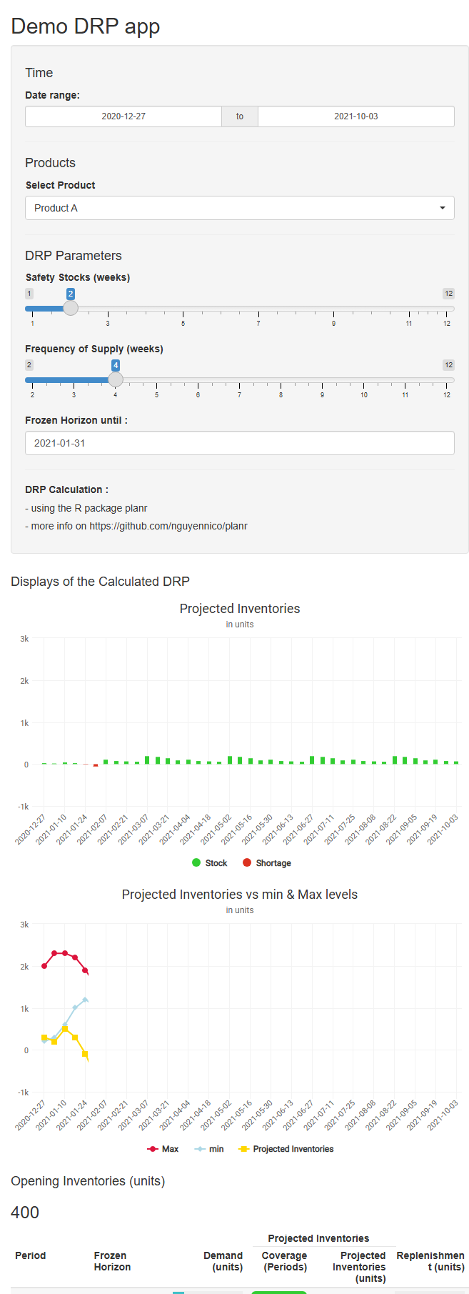
Now, let’s create a simple shiny web app to calculate a DRP (Distribution Requirement Planning).
We’ll consider only one warehouse, with 4 DFUs (A, B, C, D). Each DFU has :
Opening Inventories.
Monthly Demand Forecasts.
a Supply Plan.
Those parameters are captured inside the demo dataset downloaded from a GitHub repository.
Note : a DFU (Demand Forecast Unit) can be a product (commonly called a SKU) or a combination of SKU x location. We usually use the terminology of DFU, because it fits to a complex network with one SKU distributed through different locations, as well as a simple one (just one location, or warehouse).
We aim to calculate dynamically a DRP, which is a Replenishment Plan, directly into the shiny app by :
selecting a DFU.
using some interactive parameters such as Safety Stocks level, Frequency of Supply or Frozen Horizon.
56 Get demo dataset
# Upload dataset

# Define the URL of the raw CSV file
url <- "https://raw.githubusercontent.com/nguyennico/shiny_intro/main/drp_template_data.csv"

# Read the CSV file from the URL
df1 <- read.csv(url)

# format Period as Date
df1$Period <- as.Date(df1$Period, format = "%m/%d/%Y")

# keep results
drp_template_data <- df1

glimpse(df1)
Rows: 632
Columns: 5
$ DFU <chr> "Product A", "Product A", "Product A", "Product A", "Product A…
$ Period <date> 2023-01-01, 2021-01-10, 2023-01-15, 2022-01-16, 2021-01-17, 2…
$ Opening <int> 0, 0, 0, 0, 0, 0, 0, 0, 0, 0, 0, 0, 0, 0, 0, 0, 0, 0, 0, 0, 0,…
$ Demand <int> 100, 100, 200, 400, 200, 600, 400, 100, 400, 600, 100, 100, 60…
$ Supply <int> 0, 400, 0, 0, 0, 0, 0, 0, 0, 0, 0, 0, 0, 0, 0, 0, 0, 0, 0, 0, …57 Create the shiny app
57.1 layout
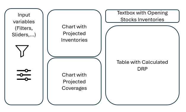
We are going to create a layout composed of :
a sidebarPanel.
with a few inputs such as :
selection of item (DFU) for which we want to calculate a DRP.
selection of time horizon to display.
DRP parameters : Safety Stocks and Frequency of Supply.
Frozen Horizon until a certain date.
those inputs will interact with the visuals displayed in the mainPanel.
a mainPanel
on the right :
a table with all the details of the calculated DRP.
with on top a textbox displaying the Opening Inventories of the selected item.
on the left :
one chart with the calculated projected inventories.
and another chart with the calculated projected coverages.
It’s a one page layout.
57.2 architecture
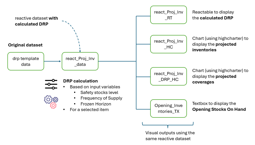
Now, let’s look at the architecture of the app, to understand how the calculation and display work :
we start by uploading the original dataset.
then, based on the selected inputs, we calculate a DRP, and store the results into a reactive data frame.
this reactive data frame is used to create 4 visuals.
Let’s note that using a reactive data frame helps to keep the code simple and effective.
57.3 shiny app
Now, let’s create the shiny app based on the layout and architecture above.
# shiny
library(shiny)
library(shinyWidgets)

# ETL
library(tidyverse)
library(sparkline)

# Charts
library(highcharter)

# Tables
library(reactable)
library(reactablefmtr)
library(DT)

# Supply Chain
library(planr)


#----------------------------------------------

#                  Upload DRP dataset

#----------------------------------------------


# Define the URL of the raw CSV file
url <- "https://raw.githubusercontent.com/nguyennico/shiny_intro/main/drp_template_data.csv"

# Read the CSV file from the URL
df1 <- read.csv(url)

# format Period as Date
df1$Period <- as.Date(df1$Period, format = "%m/%d/%Y")

# arrange
df1 <- df1 |> arrange(DFU, Period)

# keep results
drp_template_data <- df1


#----------------------------------------------

#                  Create functions

#----------------------------------------------


#----------------------------------------------
#    A Function to define a Badge Status in the reactable
#----------------------------------------------

status_badge <- function(color = "#aaa", width = "9px", height = width) {
  span(style = list(
    display = "inline-block",
    marginRight = "8px",
    width = width,
    height = height,
    backgroundColor = color,
    borderRadius = "50%"
  ))
}


#----------------------------------------------
#
#                  Shiny app
#
#----------------------------------------------


#----------------------------------------------
#
#                  SHINY UI
#
#----------------------------------------------


# Define UI for random distribution app ----
ui <- fluidPage(

  # App title ----
  titlePanel("Demo DRP app"),

  # Sidebar layout with input and output definitions ----
  sidebarLayout(

    # Sidebar panel for inputs ----
    sidebarPanel(

      h4("Time"),

      dateRangeInput("Selected.daterange", "Date range:",
                     start = "2020-12-27",
                     end   = "2021-10-03"),


      hr(),

      h4("Products"),

      pickerInput("Selected.DFU", "Select Product",
                  choices = sort(unique(as.character(drp_template_data$DFU)),
                                 decreasing = FALSE),
                  options = list(`actions-box` = TRUE),
                  multiple = F,
                  selected = unique(as.character(drp_template_data$DFU))[1]
                  ),


      hr(),
      h4("DRP Parameters"),

      sliderInput("Selected.SSCov",
                  label = "Safety Stocks (weeks)",
                  min = 1,
                  max = 12,
                  value = 2),


      sliderInput("Selected.DRPCovDur",
                  label = "Frequency of Supply (weeks)",
                  min = 2,
                  max = 12,
                  value = 4),


      dateInput("Selected.FH",
                label = "Frozen Horizon until :",
                value = "2021-01-31"),


      hr(),


      h5(strong("DRP Calculation :")),
      h5("- using the R package planr"),
      h5("- more info on https://github.com/nguyennico/planr"),

      width = 2

    ), # end of SidebarPanel


    # Main panel for displaying outputs ----
    mainPanel(


      fluidRow(

        column(5,

               h4("Displays of the Calculated DRP"),

               highchartOutput("react_Proj_Inv_HC"),


               highchartOutput("react_Proj_Inv_DRP_HC")

               ),

        column(7,

               h4("Opening Inventories (units)"),
               h3(textOutput("Opening_Inventories_TX")),

               reactableOutput("react_Proj_Inv_RT"),

               h5(strong("Notes :")),
               h5("- the DRP calculation starts after the Frozen Horizon"),
               h5("- the projected inventoires, and coverages, are always between the targeted min & max levels"),
               h5("- those leveles are dynamic, calculated based on Demand Forecasts"),
               h5("- there is also another parameter available : Reorder Qty (set to 1 by default here)")


               )


      ), # close fluidRow


      # DTOutput("react_Proj_Inv_DT"), # reactive


      width = 10

    ) # end of mainPanel
  )
)


#----------------------------------------------
#
#
#                  SHINY SERVER
#
#
#----------------------------------------------


server <- function(input, output) {


#----------------------------------------------
#                  Create Reactive
#----------------------------------------------

  react_Proj_Inv_data <- reactive({

    #--------------------
    # Get data

    df1 <- drp_template_data

    #--------------------
    # Filters

    # select the Product to be visualized
    df1 <- df1 |> filter(DFU == input$Selected.DFU)


    #--------------------
    # Transform

    #--------------
    # add DRP Parameters
    #--------------


    df1$SSCov <- input$Selected.SSCov

    df1$DRPCovDur <- input$Selected.DRPCovDur

    df1$MOQ <- 1


    # add Frozen Horizon
    df1$FH <- if_else(df1$Period <= input$Selected.FH, "Frozen", "Free")


    #--------------
    # Calculate DRP
    #--------------

    # calculate drp
    df1 <- planr::drp(data = df1,
                    DFU = DFU,
                    Period = Period,
                    Demand =  Demand,
                    Opening = Opening,
                    Supply = Supply,
                    SSCov = SSCov,
                    DRPCovDur = DRPCovDur,
                    MOQ = MOQ,
                    FH = FH
    )


    # filter
    df1 <- df1 |> filter(Period >= min(input$Selected.daterange) & Period <= max(input$Selected.daterange))


    #--------------------
    # Results
    return(df1)

  })


#----------------------------------------------
#                 Check Reactive
#----------------------------------------------

  output$react_Proj_Inv_DT <- renderDT({


    df1 <- react_Proj_Inv_data()
    df1 <- as.data.frame(df1)

    datatable(df1)

    })


#----------------------------------------------
#                 Table 1
#                 Calculated DRP
#----------------------------------------------

  output$react_Proj_Inv_RT <- renderReactable({

    #--------------------
    # Get Data

    df1 <- react_Proj_Inv_data()
    df1 <- as.data.frame(df1)


    #--------------------
    # Transform

    # keep only the needed columns
    df1 <- df1 |> select(Period,
                         FH,
                         Demand,
                         DRP.Calculated.Coverage.in.Periods,
                         DRP.Projected.Inventories.Qty,
                         DRP.plan)

    # replace missing values by zero
    df1$DRP.plan <- df1$DRP.plan |> replace_na(0)
    df1$DRP.Projected.Inventories.Qty <- df1$DRP.Projected.Inventories.Qty |> replace_na(0)

    # create a f_colorpal field
    df1 <- df1 |> mutate(f_colorpal = case_when(
      DRP.Calculated.Coverage.in.Periods > 8 ~ "#FFA500",
      DRP.Calculated.Coverage.in.Periods > 2 ~ "#32CD32",
      DRP.Calculated.Coverage.in.Periods > 0 ~ "#FFFF99",
      TRUE ~ "#FF0000" )
      )


    #--------------------
    # Table

    # create reactable
    reactable(df1, resizable = TRUE, showPageSizeOptions = TRUE,

              striped = TRUE, highlight = TRUE, compact = TRUE,
              defaultPageSize = 20,

              columns = list(

                FH = colDef(
                  name = "Frozen Horizon",

                  cell = function(value) {
                    color <- switch(
                      value,
                      Frozen = "hsl(348,83%,47%)",
                      Free = "hsl(150, 52%, 51%)"
                    )
                    badge <- status_badge(color = color)
                    tagList(badge, value)
                  }),


                Demand = colDef(
                  name = "Demand (units)",

                  cell = data_bars(df1,
                                   fill_color = "#3fc1c9",
                                   text_position = "outside-end"
                  )

                ),

                DRP.Calculated.Coverage.in.Periods = colDef(
                  name = "Coverage (Periods)",
                  maxWidth = 90,
                  cell= color_tiles(df1, color_ref = "f_colorpal")
                ),

                f_colorpal = colDef(show = FALSE), # hidden, just used for the coverages

                `DRP.Projected.Inventories.Qty`= colDef(
                  name = "Projected Inventories (units)",
                  format = colFormat(separators = TRUE, digits=0),

                  style = function(value) {
                    if (value > 0) {
                      color <- "#008000"
                    } else if (value < 0) {
                      color <- "#e00000"
                    } else {
                      color <- "#777"
                    }
                    list(color = color)
                  }
                ),

                DRP.plan = colDef(
                  name = "Replenishment (units)",
                  cell = data_bars(df1,
                                   fill_color = "#3CB371",
                                   text_position = "outside-end"
                  )
                )

              ), # close columns lits

              columnGroups = list(

                colGroup(name = "Projected Inventories",
                         columns = c("DRP.Calculated.Coverage.in.Periods",
                                     "DRP.Projected.Inventories.Qty")
                         )

              )

    ) # close reactable


  })


#----------------------------------------------

#                 Chart 1

#----------------------------------------------

  output$react_Proj_Inv_HC <- renderHighchart({

    #--------------------
    # Get Data

    df1 <- react_Proj_Inv_data()
    df1 <- as.data.frame(df1)


    #--------------------
    # Transform

    # keep only the needed columns
    df1 <- df1 |> select(Period,
                          DRP.Projected.Inventories.Qty)


    # create a value.index
    df1$Value.Index <- if_else(df1$DRP.Projected.Inventories.Qty < 0, "Shortage", "Stock")


    # spread
    df1 <- df1 |> spread(Value.Index, DRP.Projected.Inventories.Qty)

    # formatting
    df1 <- as.data.frame(df1)


    #--------------------
    # Chart

    highchart() |>

      hc_title(text = "Projected Inventories") |>
      hc_subtitle(text = "in units") |>
      hc_add_theme(hc_theme_google()) |>

      hc_xAxis(categories = df1$Period) |>

      hc_add_series(name = "Stock",
                    color = "#32CD32",
                    #dataLabels = list(align = "center", enabled = TRUE),
                    data = df1$Stock) |>

      hc_add_series(name = "Shortage",
                    color = "#dc3220",
                    #dataLabels = list(align = "center", enabled = TRUE),
                    data = df1$Shortage) |>

      hc_chart(type = "column") |>
      hc_plotOptions(series = list(stacking = "normal"))


  })


#----------------------------------------------

#                 Chart 2

#----------------------------------------------

  output$react_Proj_Inv_DRP_HC <- renderHighchart({

    #--------------------
    # Get Data

    df1 <- react_Proj_Inv_data()
    df1 <- as.data.frame(df1)


    #--------------------
    # Chart


    highchart() |>

      hc_add_series(name = "Max",
                    color = "crimson",
                    data = df1$Maximum.Stocks) |>

      hc_add_series(name = "min",
                    color = "lightblue",
                    data = df1$Safety.Stocks) |>

      hc_add_series(name = "Projected Inventories",
                    color = "gold",
                    data = df1$DRP.Projected.Inventories.Qty) |>

      hc_title(text = "Projected Inventories vs min & Max levels") |>
      hc_subtitle(text = "in units") |>
      hc_xAxis(categories = df1$Period) |>
      hc_add_theme(hc_theme_google())

  })


#----------------------------------------------

#                 Text 1
#                 Opening Inventories

#----------------------------------------------


  output$Opening_Inventories_TX <- renderText({


    #--------------------
    # Get Data

    df1 <- react_Proj_Inv_data()
    df1 <- as.data.frame(df1)


    #--------------------
    # Transform

    # replace missing values by zero
    df1$Opening <- df1$Opening |> replace_na(0)

    value1 <- sum(df1$Opening)
    value1 <- formatC(value1, format="d", big.mark=',')

    value1


  })


#------------------------------------------------
} # close server


#----------------------------------------------
#
#
#                  END of SHINY UI and SERVER
#
#
#----------------------------------------------


# Create Shiny app ----
shinyApp(ui, server)