# ETL
library(tidyverse)
library(sparkline)

# for the tables
library(reactable)
library(reactablefmtr)

# for the charts
library(highcharter)

# Supply Chain
library(planr)

# Others
library(htmltools)26 Projected Inventories and Coverages
We’re going to present here how to use, on one product, the function light_proj_inv() from the R package planr.
It’s a simple function to calculate quickly projected inventories & coverages.
We just need 5 variables to use this function :
a Product: it’s an item, a SKU (Storage Keeping Unit), or a SKU at a location, also called a DFU (Demand Forecast Unit).
a Period of time : for example monthly or weekly buckets.
a Demand : could be some sales forecasts, expressed in units.
an Opening Inventory : what we hold as available inventories at the beginning of the horizon, also called Stock On Hand (SoH), expressed in units.
a Supply Plan : the supplies that we plan to receive at each period of time, expressed in units.
As a result, we will get 2 additional variables, showing the calculated projected inventories and coverages.
To practice, we are going to :
apply the
light_proj_inv()on a simple template.then create 2 nice visuals of tables and charts.
- using the R packages
reactable,reactablefmtrandhighcharter.
- using the R packages
First, let’s upload the libraries we are going to use :
27 A single SKU
Create a demo dataset
Let’s create a data frame which contains those basic features.
It will contain the 5 variables required : Period / Demand / Opening / Supply and a DFU.
We’ll call it my_demand_and_suppply_data.
# let's create 4 variables
Period <- c(
"1/1/2020", "2/1/2020", "3/1/2020", "4/1/2020", "5/1/2020", "6/1/2020", "7/1/2020", "8/1/2020", "9/1/2020", "10/1/2020", "11/1/2020", "12/1/2020","1/1/2021", "2/1/2021", "3/1/2021", "4/1/2021", "5/1/2021", "6/1/2021", "7/1/2021", "8/1/2021", "9/1/2021", "10/1/2021", "11/1/2021", "12/1/2021")

Demand <- c(360, 458,300,264,140,233,229,208,260,336,295,226,336,434,276,240,116,209,205,183,235,312,270,201)

Opening <- c(1310,0,0,0,0,0,0,0,0,0,0,0,0,0,0,0,0,0,0,0,0,0,0,0)

Supply <- c(0,0,0,0,0,2500,0,0,0,0,0,0,0,0,0,2000,0,0,0,0,0,0,0,0)


# assemble those variables in a dataframe
df1 <- data.frame(Period,
                  Demand,
                  Opening,
                  Supply)

# let's add a Product
df1$DFU <- "Product A"

# format the Period as a date
df1$Period <- as.Date(df1$Period, format = '%m/%d/%Y')


# keep results
my_demand_and_suppply_data <- df1

# let's have a look at it
head(my_demand_and_suppply_data)
Period Demand Opening Supply DFU
1 2020-01-01 360 1310 0 Product A
2 2020-02-01 458 0 0 Product A
3 2020-03-01 300 0 0 Product A
4 2020-04-01 264 0 0 Product A
5 2020-05-01 140 0 0 Product A
6 2020-06-01 233 0 2500 Product AWe now have a simple data frame with 5 variables, capturing all the basic elements to calculate Projected Inventories and Coverages.
The Period of time here is in monthly bucket. It also could be in weekly bucket.
In this simple example we only have one DFU (Product), but we could have hundreds as well.
The concept to create this input data frame is illustrated in the figure below :
we combine 3 elements into a single data frame :
- Opening Inventories | Demand Forecasts | Supply Plan.
then we apply the function
light_proj_inv()to this data frame.
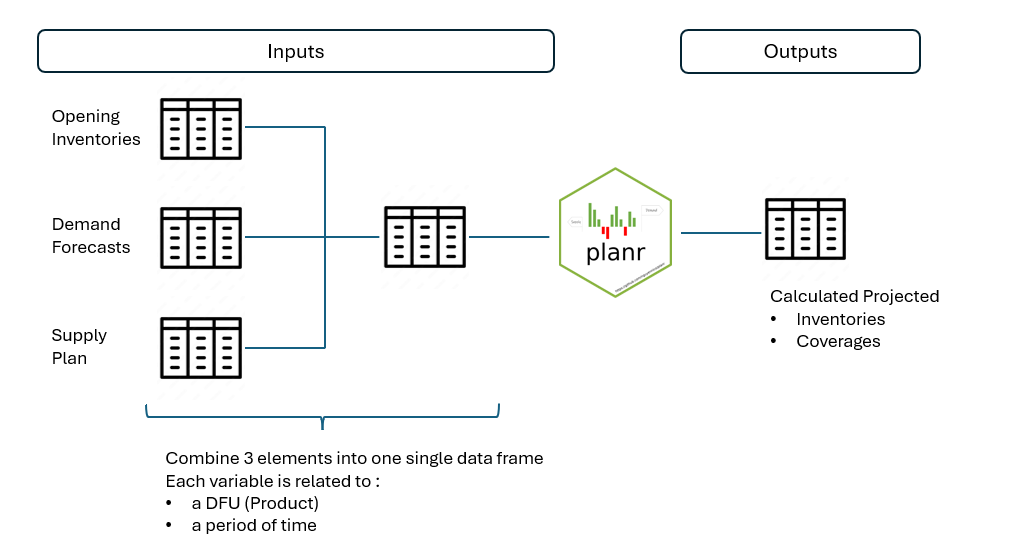
Note :
this simple example is with only one DFU, and we can apply the same logic and code to a portfolio with multiple items (of course!).
we also can aggregate (sum) the different variables (Opening Inventories, Demand Forecasts and Supply Plan) to calculate the projected inventories and coverages at a higher (aggregated) level.
27.1 Calculate Projected Inventories & Coverages
Now let’s apply the function light_proj_inv().
We are going to calculate 2 new features for the DFU :
projected inventories.
projected coverages, based on the Demand Forecasts.
# calculate
df1 <- planr::light_proj_inv(
  dataset = my_demand_and_suppply_data,
  DFU = DFU,
  Period = Period,
  Demand =  Demand,
  Opening = Opening,
  Supply = Supply)

# keep results
calculated_projection_data <- df1

# see results
glimpse(calculated_projection_data)
Rows: 24
Columns: 7
$ DFU <chr> "Product A", "Product A", "Product A", …
$ Period <date> 2020-01-01, 2020-02-01, 2020-03-01, 20…
$ Demand <dbl> 360, 458, 300, 264, 140, 233, 229, 208,…
$ Opening <dbl> 1310, 0, 0, 0, 0, 0, 0, 0, 0, 0, 0, 0, …
$ Calculated.Coverage.in.Periods <dbl> 2.7, 1.7, 0.7, 0.0, 0.0, 7.4, 6.4, 5.4,…
$ Projected.Inventories.Qty <dbl> 950, 492, 192, -72, -212, 2055, 1826, 1…
$ Supply <dbl> 0, 0, 0, 0, 0, 2500, 0, 0, 0, 0, 0, 0, …We obtain a data frame with 2 new variables :
projected inventories : Projected.Inventories.Qty
- displaying in this example some negative values, which means that we project a shortage, here in the months of April and May 2020.
projected coverages : Calculated.Coverage.in.Periods
based on the Demand Forecasts.
expressed in period of time, so here in months.
- note : when we project a shortage, the related coverage is 0.
We also can notice that the output is standardized :
on the left side of the table, there are 4 variables : DFU | Period | Demand | Opening Inventories.
in the center : (calculated) projected Coverages & Inventories.
on the right side : Supply Plan.
Now, let’s use some other packages to create 2 nice visuals for the table, and also for the projected inventories.
27.2 Display table
We will use the libraries reactable and reactablefmtr to create a nice table.
To keep the table lighter, we will exclude here the Opening Inventories.
We will define a color code for the variable Calculated.Coverage.in.Periods, using the function case_when(), to affect a color based on the value. For this we create a variable called f_colorpal.
This variable f_colorpal will be used in the reactable to color the variable Calculated.Coverage.in.Periods, and then it will be hidden from the reactable, using the syntax f_colorpal = colDef(show = FALSE) .
The aim is to quickly visualize the projected high and low coverages, and shortages.
Here is the code to create this reactable.
Note : to keep the table “short” we also use the argument defaultPageSize = 20 to limit the display in the first page to the first 20 rows.
#-------------------
# Get data
#-------------------

# set a working df
df1 <- calculated_projection_data


#-------------------
# Transform
#-------------------

# keep only the needed columns
df1 <- df1 |> select(Period,
                     Demand,
                     Calculated.Coverage.in.Periods,
                     Projected.Inventories.Qty,
                     Supply)


# create a f_colorpal field
df1 <- df1 |> mutate(f_colorpal = case_when(
  Calculated.Coverage.in.Periods > 6 ~ "#FFA500",
  Calculated.Coverage.in.Periods > 2 ~ "#32CD32",
  Calculated.Coverage.in.Periods > 0 ~ "#FFFF99",
  TRUE ~ "#FF0000" ))


#-------------------
# Table
#-------------------


# create reactable
reactable(df1, resizable = TRUE, showPageSizeOptions = TRUE,

              striped = TRUE, highlight = TRUE, compact = TRUE,
              defaultPageSize = 20,

              columns = list(

                Demand = colDef(
                  name = "Demand (units)",

                  cell = data_bars(df1,
                                   fill_color = "#3fc1c9",
                                   text_position = "outside-end"
                  )

                ),

              Calculated.Coverage.in.Periods = colDef(
                name = "Coverage (Periods)",
                maxWidth = 90,
                cell = color_tiles(df1,
                                   color_ref = "f_colorpal")
                ),

              f_colorpal = colDef(show = FALSE), # hidden, just used for the coverages

                `Projected.Inventories.Qty`= colDef(
                  name = "Projected Inventories (units)",
                  format = colFormat(separators = TRUE, digits=0),

                  style = function(value) {
                    if (value > 0) {
                      color <- "#008000"
                    } else if (value < 0) {
                      color <- "#e00000"
                    } else {
                      color <- "#777"
                    }
                    list(color = color
                         #fontWeight = "bold"
                    )
                  }
                ),

              Supply = colDef(
                name = "Supply (units)",
                cell = data_bars(df1,
                                 fill_color = "#3CB371",
                                 text_position = "outside-end"
                                 )
                )

              ), # close columns list

              columnGroups = list(

                colGroup(name = "Projected Inventories",
                         columns = c("Calculated.Coverage.in.Periods",
                                     "Projected.Inventories.Qty")
                         )

                )

    ) # close reactable
Hey! It’s getting nicer!
We can quickly spot the periods of time when we will be in shortage, in low stocks and also in overstocks situations.
27.3 Display chart
Now let’s create a chart to look at the Projected Inventories.
The idea is to quickly visualize when we have stocks, and when we project to be in shortage.
#-------------------
# Get data
#-------------------

# set a working df
df1 <- calculated_projection_data


#-------------------
# Transform
#-------------------


# keep only the needed columns
df1 <- df1 |> select(Period, Projected.Inventories.Qty)


# create a value.index
df1$Value.Index <- if_else(df1$Projected.Inventories.Qty < 0, "Shortage", "Stock")


# spread
df1 <- df1 |> spread(Value.Index, Projected.Inventories.Qty)


#-------------------
# Chart
#-------------------

highchart() |>

  hc_title(text = "Projected Inventories") |>
  hc_subtitle(text = "in units") |>
  hc_add_theme(hc_theme_google()) |>

  hc_xAxis(categories = df1$Period) |>


  hc_add_series(name = "Stock",
                color = "#32CD32",
                #dataLabels = list(align = "center", enabled = TRUE),
                data = df1$Stock) |>

  hc_add_series(name = "Shortage",
                color = "#dc3220",
                #dataLabels = list(align = "center", enabled = TRUE),
                data = df1$Shortage) |>


  hc_chart(type = "column") |>
  hc_plotOptions(series = list(stacking = "normal"))
This chart is somehow similar to the display of the projected inventories inside the previous table.
Sometimes it’s convenient to see just a chart :
faster to read, focusing on one topic (variable) : here the projected inventories.
we quickly can spot the issue : when and how important are the stocks levels, especially here the projected shortages.
28 A portfolio
We saw how the function light_proj_inv() works on a simple example with one SKU. Now, let’s apply it to a group, a portfolio, of items.
Let’s practice using the built-in demo data frame blueprint_light from the R package planr.
# get data
df1 <- blueprint_light

head(df1)
# A tibble: 6 × 5
DFU Period Demand Opening Supply
<chr> <date> <dbl> <dbl> <dbl>
1 Item 000001 2022-07-03 364 6570 0
2 Item 000001 2022-07-10 364 0 0
3 Item 000001 2022-07-17 364 0 0
4 Item 000001 2022-07-24 260 0 0
5 Item 000001 2022-07-31 736 0 0
6 Item 000001 2022-08-07 859 0 028.1 Overview Demo data frame
Let’s have a summary view, using the reactable package:
#-----------------
# Get Summary of variables
#-----------------

# set a working df
df1 <- blueprint_light

# aggregate
df1 <- df1 |> group_by(DFU) |>
      summarise(Demand = sum(Demand),
                Opening = sum(Opening),
                Supply = sum(Supply)
                )

# let's calculate the share of Demand
df1$Demand.pc <- df1$Demand / sum(df1$Demand)


# keep Results
Value_data <- df1


#-----------------
# Get Sparklines Demand
#-----------------

# set a working df
df1 <- blueprint_light

# replace missing values by zero
df1$Demand <- df1$Demand |> replace_na(0)

# aggregate
df1 <- df1 |> group_by(DFU, Period) |>
      summarise(Quantity = sum(Demand)
                )

# generate Sparkline
df1 <- df1 |> group_by(DFU) |>
  summarise(Demand.Quantity = list(Quantity)
            )

# keep Results
Demand_Sparklines_data <- df1


#-----------------
# Get Sparklines Supply
#-----------------

# set a working df
df1 <- blueprint_light

# replace missing values by zero
df1$Supply <- df1$Supply |> replace_na(0)

# aggregate
df1 <- df1 |> group_by(DFU, Period) |>
  summarise(Quantity = sum(Supply)
            )

# generate Sparkline
df1 <- df1 |> group_by(DFU) |>
  summarise(Supply.Quantity = list(Quantity)
            )

# keep Results
Supply_Sparklines_data <- df1


#-----------------
# Merge dataframes
#-----------------

# merge
df1 <- left_join(Value_data, Demand_Sparklines_data)
df1 <- left_join(df1, Supply_Sparklines_data)


# reorder columns
df1 <- df1 |> select(DFU, Demand, Demand.pc, Demand.Quantity, Opening,
                      Supply, Supply.Quantity)


# get results
Summary_data <- df1

glimpse(Summary_data)
Rows: 10
Columns: 7
$ DFU <chr> "Item 000001", "Item 000002", "Item 000003", "Item 000…
$ Demand <dbl> 20294, 60747, 5975, 68509, 119335, 101810, 13823, 2075…
$ Demand.pc <dbl> 0.032769097, 0.098089304, 0.009647943, 0.110622748, 0.…
$ Demand.Quantity <list> <364, 364, 364, 260, 736, 859, 859, 859, 273, 349, 34…
$ Opening <dbl> 6570, 5509, 2494, 7172, 17500, 9954, 2092, 17500, 1222…
$ Supply <dbl> 6187, 17927, 3000, 20000, 30000, 21660, 6347, 73000, 7…
$ Supply.Quantity <list> <0, 0, 0, 0, 0, 0, 0, 0, 0, 0, 0, 0, 0, 0, 5000, 0, 0…and now let’s create the reactable :
reactable(df1,compact = TRUE,

              defaultSortOrder = "desc",
              defaultSorted = c("Demand"),
              defaultPageSize = 20,

              columns = list(

                `DFU` = colDef(name = "DFU"),


                `Demand`= colDef(
                  name = "Total Demand (units)",
                  aggregate = "sum",
                  footer = function(values) formatC(sum(values),
                                                    format="f",
                                                    big.mark=",", digits=0),
                  format = colFormat(separators = TRUE, digits=0),
                  style = list(background = "yellow",fontWeight = "bold")
                  ),


                `Demand.pc`= colDef(
                  name = "Share of Demand (%)",
                  format = colFormat(percent = TRUE, digits = 1)
                  ), # close %


                `Supply`= colDef(
                  name = "Total Supply (units)",
                  aggregate = "sum",
                  footer = function(values) formatC(sum(values),
                                                    format="f",
                                                    big.mark=",", digits=0),
                  format = colFormat(separators = TRUE, digits=0)
                  ),


                `Opening`= colDef(
                  name = "Opening Inventories (units)",
                  aggregate = "sum",
                  footer = function(values) formatC(sum(values),
                                                    format="f",
                                                    big.mark=",",
                                                    digits=0),
                  format = colFormat(separators = TRUE, digits=0)
                  ),


                Demand.Quantity = colDef(
                  name = "Projected Demand",
                  cell = function(value, index) {
                    sparkline(df1$Demand.Quantity[[index]])
                  }),


                Supply.Quantity = colDef(
                  name = "Projected Supply",
                  cell = function(values) {
                    sparkline(values, type = "bar"
                    )
                  })


              ), # close columns list

              defaultColDef = colDef(footerStyle = list(fontWeight = "bold")),


              columnGroups = list(

                colGroup(name = "Demand",
                         columns = c("Demand",
                                     "Demand.pc",
                                     "Demand.Quantity")
                         ),

                colGroup(name = "Supply",
                         columns = c("Supply",
                                     "Supply.Quantity")
                         )


              )

) # close reactable
This portfolio contains 10 items with different Demand Forecasts, Opening Inventories and Supply Plans.
28.2 Calculate Projected Inventories & Coverages
Now, let’s calculate the projected inventories and coverages by item.
As we did previously, we apply the function light_proj_inv() on this data frame, as below :
# set a working df
df1 <- blueprint_light

# calculate
df1 <- planr::light_proj_inv(dataset = df1,
                             DFU = DFU,
                             Period = Period,
                             Demand = Demand,
                             Opening = Opening,
                             Supply = Supply)
Joining with `by = join_by(DFU, Period)`# keep results
calculated_projection_data <- df1
# see results
head(calculated_projection_data) DFU Period Demand Opening Calculated.Coverage.in.Periods
1 Item 000001 2022-07-03 364 6570 16.8
2 Item 000001 2022-07-10 364 0 15.8
3 Item 000001 2022-07-17 364 0 14.8
4 Item 000001 2022-07-24 260 0 13.8
5 Item 000001 2022-07-31 736 0 12.8
6 Item 000001 2022-08-07 859 0 11.8
Projected.Inventories.Qty Supply
1 6206 0
2 5842 0
3 5478 0
4 5218 0
5 4482 0
6 3623 028.3 Analysis
28.3.1 For one Item
Let’s select one item, for example the DFU “Item 000001”, and look at the results.
# set a working df
df1 <- calculated_projection_data

# filter data
Selected_data <- filter(df1, df1$DFU == "Item 000001")


glimpse(Selected_data)
Rows: 52
Columns: 7
$ DFU <chr> "Item 000001", "Item 000001", "Item 000…
$ Period <date> 2022-07-03, 2022-07-10, 2022-07-17, 20…
$ Demand <dbl> 364, 364, 364, 260, 736, 859, 859, 859,…
$ Opening <dbl> 6570, 0, 0, 0, 0, 0, 0, 0, 0, 0, 0, 0, …
$ Calculated.Coverage.in.Periods <dbl> 16.8, 15.8, 14.8, 13.8, 12.8, 11.8, 10.…
$ Projected.Inventories.Qty <dbl> 6206, 5842, 5478, 5218, 4482, 3623, 276…
$ Supply <dbl> 0, 0, 0, 0, 0, 0, 0, 0, 0, 0, 0, 0, 0, …Let’s create a table using reactable, simply using the same code that we saw previously :
#-------------------
# Get data
#-------------------

# set a working df
df1 <- Selected_data


#-------------------
# Transform
#-------------------

# keep only the needed columns
df1 <- df1 |> select(Period,
                     Demand,
                     Calculated.Coverage.in.Periods,
                     Projected.Inventories.Qty,
                     Supply)


# create a f_colorpal field
df1 <- df1 |> mutate(f_colorpal = case_when(
  Calculated.Coverage.in.Periods > 6 ~ "#FFA500",
  Calculated.Coverage.in.Periods > 2 ~ "#32CD32",
  Calculated.Coverage.in.Periods > 0 ~ "#FFFF99",
  TRUE ~ "#FF0000" ))


#-------------------
# Table
#-------------------


# create reactable
reactable(df1, resizable = TRUE, showPageSizeOptions = TRUE,

              striped = TRUE, highlight = TRUE, compact = TRUE,
              defaultPageSize = 20,

              columns = list(

                Demand = colDef(
                  name = "Demand (units)",

                  cell = data_bars(df1,
                                   fill_color = "#3fc1c9",
                                   text_position = "outside-end"
                  )

                ),

              Calculated.Coverage.in.Periods = colDef(
                name = "Coverage (Periods)",
                maxWidth = 90,
                cell = color_tiles(df1,
                                   color_ref = "f_colorpal")
                ),

              f_colorpal = colDef(show = FALSE), # hidden, just used for the coverages

                `Projected.Inventories.Qty`= colDef(
                  name = "Projected Inventories (units)",
                  format = colFormat(separators = TRUE, digits=0),

                  style = function(value) {
                    if (value > 0) {
                      color <- "#008000"
                    } else if (value < 0) {
                      color <- "#e00000"
                    } else {
                      color <- "#777"
                    }
                    list(color = color
                         #fontWeight = "bold"
                    )
                  }
                ),

              Supply = colDef(
                name = "Supply (units)",
                cell = data_bars(df1,
                                 fill_color = "#3CB371",
                                 text_position = "outside-end"
                                 )
                )

              ), # close columns list

              columnGroups = list(

                colGroup(name = "Projected Inventories",
                         columns = c("Calculated.Coverage.in.Periods",
                                     "Projected.Inventories.Qty")
                         )

                )

    ) # close reactable
This works well if we want to look at a specific item. But in the case of multiple items, we need to have a different approach, using :
a supply risks alarm format.
a cockpit.
28.3.2 Supply Risk Alarm
We can create a simple table that we could call a “Supply Risks Alarm”, giving a quick overview of the :
projected inventories.
projected coverages.
In the methodology below we start by creating a data frame Initial_data that we have already filtered on the horizon of analysis (i.e. between 2 periods of time). Then we use this data frame to create 2 other ones, Value_data and SRA_data, that we will merge.
The interest of the data frame Value_data is to sort the items considering their volume of Demand, i.e by importance.
#------------------------------
# Get data
df1 <- calculated_projection_data


#------------------------------
# Filter

# filter Period based on those Starting and Ending Periods
df1 <- df1 |> filter(Period >= "2022-07-03" & Period <= "2022-09-25")


#--------
# Keep Initial data
#--------

# replace missing values by zero
df1$Demand <- df1$Demand |> replace_na(0)

Initial_data <- df1


#------------------------------
# Transform


#--------
# Create a Summary database
#--------

# set a working df
df1 <- Initial_data

# aggregate
df1 <- df1 |> group_by(DFU) |>
  summarise(Demand.Qty = sum(Demand)
            )


# Get Results
Value_data <- df1


#--------
# Create the SRA
#--------

# set a working df
df1 <- Initial_data

#------------------------------
# keep only the needed columns
df1 <- df1 |> select(DFU, Period, Calculated.Coverage.in.Periods)


# format as numeric
df1$Calculated.Coverage.in.Periods <- as.numeric(df1$Calculated.Coverage.in.Periods)

# formatting 1 digit after comma
df1$Calculated.Coverage.in.Periods = round(df1$Calculated.Coverage.in.Periods, 1)

# spread data
df1 <- df1 |> spread(Period, Calculated.Coverage.in.Periods)

# replace missing values by zero
df1[is.na(df1)] <- 0

# Get Results
SRA_data <- df1


#--------
# Merge both database
#--------

# merge both databases
df1 <- left_join(Value_data, SRA_data)

# Sort by Demand.Qty descending
df1 <- df1 |> arrange(desc(Demand.Qty))


# rename column
#df1 <- df1 |> rename("Total Demand (units)" = Demand.Qty)


# Get Results
Interim_data <- df1
Let’s visualize using a reactable. For this, we are going to use the similar code that we saw in the chapter related to the formatting of a reactable.
As before, we start by creating a function. We will call it highlight_cells() .
Now, let’s highlight :
in steelblue all the cells > 6 periods of coverage.
in gold the ones below 2 and above 0 periods of coverage.
and finally in red the ones equal to zero, i.e. in shortage.
# Define a custom cell renderer to highlight values
highlight_cells <- function(value) {
  if (value > 6) {
    return(htmltools::div(style = "background-color: steelblue;", value))
  } else if (value < 2 & value >0) {
    return(htmltools::div(style = "background-color: gold;", value))
  } else if (value == 0) {
    return(htmltools::div(style = "background-color: red;", value))
  } else {
    return(value)
  }
}
Let’s apply this function to the different columns of the data frame and keep the results as a list, called column_defs :
# Create column definitions dynamically
column_defs <- list(DFU = colDef(name = "DFU",
                                 sticky = "left"),

                    Demand.Qty = colDef(name = "Total Demand (units)")
                    )

# Add the dynamic column definitions for the remaining columns
for (col in names(Interim_data)[-c(1,2)]) {
  column_defs[[col]] <- colDef(cell = highlight_cells)
}
Note that we exclude the first 2 columns from our formatting, using the syntax [-c(1,2)] .
Now we can create the reactable :
# Create the reactable table with custom cell rendering
reactable(
  Interim_data,
  columns = column_defs
)
28.3.3 Add Delay Analysis Check
We can imagine creating a tag to inform us when the projected inventories are negative, which means we have a risk of delay.
It’s somehow like “screening” all the projected inventories (in a pretty simple way!).
First, we create a summary table to identify which items have negative inventories over the selected horizon of time. We’ll call it Check_data .
#--------
# Create a Delay.Analysis check
#--------

# set a working df
df1 <- Initial_data

# aggregate
df1 <- df1 |> group_by(DFU) |>
      summarise(min.Projected.Inventories.Qty = min(Projected.Inventories.Qty),
                max.Projected.Inventories.Qty = max(Projected.Inventories.Qty)
                )


#-----------------
# Identify where we are late to supply
#-----------------

# Add a character info to analyze whether there is an identified delay or not
df1$Delay.Analysis <- if_else(df1$min.Projected.Inventories.Qty <= 0, "Delay", "OK")

# Get Results
Check_data <- df1

head(Check_data)
# A tibble: 6 × 4
DFU min.Projected.Inventories.…¹ max.Projected.Invent…² Delay.Analysis
<chr> <dbl> <dbl> <chr>
1 Item 000001 385 6206 OK
2 Item 000002 1252 10954 OK
3 Item 000003 1180 2229 OK
4 Item 000004 98 9307 OK
5 Item 000005 3100 28600 OK
6 Item 000006 6531 15730 OK
# ℹ abbreviated names: ¹min.Projected.Inventories.Qty,
# ²max.Projected.Inventories.QtyWe now have a variable Delay.Analysis with 2 character values “Delay” and “OK” that we can use to filter the data frame, keeping only the items with a projected delay for example.
Now let’s add this Check_data data frame to the previous one :
#--------
# Merge
#--------

# merge
df1 <- left_join(Check_data, Interim_data)
df1 <- as.data.frame(df1)

# Note : we could use a filter to keep only those rows, in a Shiny app for example
# the syntax would be :

# filter on Delay.Analysis
# df1 <- df1 |> filter(Delay.Analysis %in% input$Selected.Delay.Analysis)


#  needed variables
df1 <- df1 |> select(-min.Projected.Inventories.Qty,
                     -max.Projected.Inventories.Qty)

# keep results
Interim_data <- df1

# display
Interim_data
DFU Delay.Analysis Demand.Qty 2022-07-03 2022-07-10 2022-07-17
1 Item 000001 OK 6185 16.8 15.8 14.8
2 Item 000002 OK 18458 3.3 2.3 1.3
3 Item 000003 OK 1314 25.3 24.3 23.3
4 Item 000004 OK 12336 6.1 5.1 4.1
5 Item 000005 OK 29700 7.7 6.7 5.7
6 Item 000006 OK 17846 6.5 5.5 4.5
7 Item 000007 OK 3870 7.6 6.6 5.6
8 Item 000008 Delay 49416 1.6 0.6 3.7
9 Item 000009 OK 909 15.8 14.8 13.8
10 Item 000010 Delay 5190 8.3 7.3 6.3
2022-07-24 2022-07-31 2022-08-07 2022-08-14 2022-08-21 2022-08-28 2022-09-04
1 13.8 12.8 11.8 10.8 9.8 8.8 7.8
2 7.6 6.6 5.6 4.6 3.6 6.7 5.7
3 22.3 21.3 20.3 19.3 18.3 17.3 16.3
4 3.1 2.1 1.1 0.1 8.7 7.7 6.7
5 4.7 3.7 2.7 1.7 0.7 13.0 12.0
6 9.1 8.1 7.1 6.1 5.1 10.1 9.1
7 11.5 10.5 9.5 8.5 7.5 6.5 5.5
8 2.7 5.4 4.4 3.4 2.4 1.4 1.6
9 12.8 11.8 10.8 9.8 8.8 7.8 6.8
10 5.3 4.3 4.0 3.0 2.0 1.0 0.0
2022-09-11 2022-09-18 2022-09-25
1 6.8 5.8 4.8
2 4.7 3.7 2.7
3 15.3 14.3 13.3
4 5.7 4.7 3.7
5 11.0 10.0 9.0
6 8.1 7.1 6.1
7 4.5 3.5 2.5
8 0.6 0.0 0.0
9 5.8 4.8 3.8
10 0.0 0.0 4.2Update the function column_defs(), excluding the formatting from the first 3 columns :
# Create column definitions dynamically
column_defs <- list(DFU = colDef(name = "DFU",
                                 sticky = "left"),
                    Demand.Qty = colDef(name = "Total Demand (units)"))

# Add the dynamic column definitions for the remaining columns
for (col in names(Interim_data)[-c(1:3)]) {
  column_defs[[col]] <- colDef(cell = highlight_cells)
}
Display reactable :
# Create the reactable table with custom cell rendering
reactable(
  Interim_data, filterable = TRUE,
  columns = column_defs
)
By looking at the variable Delay.Analysis we quickly can see whether there is a projected shortage.
It’s also a variable that we can use to filter the data, and focus only on the ones which are at risk.
28.4 Cockpit
We can also use another way -more compact- a cockpit, to get :
an overview of the projected inventories.
an analysis of the projected values.
Let’s create the data frame for this cockpit, and then visualize it through a reactable.
28.4.1 Create Data frame
#------------------------------
# Get data
df1 <- calculated_projection_data


#------------------------------
# Filter

# filter Period based on those Starting and Ending Periods
df1 <- df1 |> filter(Period >= "2022-07-03" & Period <= "2022-09-25")


# keep this initial dataset
Initial_data <- df1


#-----------------
# Get Summary of variables
#-----------------

# set a working df
df1 <- Initial_data

# aggregate
df1 <- df1 |> group_by(DFU) |>
      summarise(Demand = sum(Demand),
                Opening = sum(Opening),
                Supply = sum(Supply)
                )

# let's calculate the share of Demand
df1$Demand.pc <- df1$Demand / sum(df1$Demand)


# keep Results
Value_data <- df1


#-----------------
# Get Sparklines Demand
#-----------------

# set a working df
df1 <- Initial_data

# replace missing values by zero
df1$Demand <- df1$Demand |> replace_na(0)

# aggregate
df1 <- df1 |> group_by(DFU, Period) |>
      summarise(Quantity = sum(Demand))

# generate Sparkline
df1 <- df1 |> group_by(DFU) |>
      summarise(Demand.Quantity = list(Quantity))

# keep Results
Demand_Sparklines_data <- df1


#-----------------
# Get Sparklines Supply
#-----------------

# set a working df
df1 <- Initial_data

# replace missing values by zero
df1$Supply <- df1$Supply |> replace_na(0)

# aggregate
df1 <- df1 |> group_by(DFU, Period) |>
      summarise(Quantity = sum(Supply))

# generate Sparkline
df1 <- df1 |> group_by(DFU) |>
      summarise(Supply.Quantity = list(Quantity))

# keep Results
Supply_Sparklines_data <- df1


#-----------------
# Get Sparklines Projected Inventories
#-----------------

# set a working df
df1 <- Initial_data

# replace missing values by zero
df1$Projected.Inventories.Qty <- df1$Projected.Inventories.Qty |> replace_na(0)

# aggregate
df1 <- df1 |> group_by(DFU,Period) |>
      summarise(
        Quantity = sum(Projected.Inventories.Qty)
      )

# generate Sparkline
df1 <- df1 |> group_by(DFU) |>
  summarise(PI.Quantity = list(Quantity)
            )

# keep Results
PI_Sparklines_data <- df1


#--------
# Create a Delay.Analysis check
#--------

# set a working df
df1 <- Initial_data

# aggregate
df1 <- df1 |> group_by(DFU) |>
      summarise(min.Projected.Inventories.Qty = min(Projected.Inventories.Qty),
                max.Projected.Inventories.Qty = max(Projected.Inventories.Qty)
                )


#-----------------
# Identify where we are late to supply
#-----------------

# Add a character info to analyze whether there is an identified delay or not
df1$Delay.Analysis <- if_else(df1$min.Projected.Inventories.Qty <= 0,
                              "Delay",
                              "OK")

# Get Results
Check_data <- df1


#-----------------
# Merge dataframes
#-----------------

# merge
df1 <- left_join(Value_data, Demand_Sparklines_data)
df1 <- left_join(df1, Supply_Sparklines_data)
df1 <- left_join(df1, PI_Sparklines_data)
df1 <- left_join(df1, Check_data)


# reorder columns
df1 <- df1 |> select(DFU,
                     Demand, Demand.pc, Demand.Quantity,
                     Supply, Supply.Quantity,
                     Opening,
                     PI.Quantity,
                     Delay.Analysis)


# get results
Summary_data <- df1

glimpse(Summary_data)
Rows: 10
Columns: 9
$ DFU <chr> "Item 000001", "Item 000002", "Item 000003", "Item 000…
$ Demand <dbl> 6185, 18458, 1314, 12336, 29700, 17846, 3870, 49416, 9…
$ Demand.pc <dbl> 0.042589379, 0.127100204, 0.009048091, 0.084944637, 0.…
$ Demand.Quantity <list> <364, 364, 364, 260, 736, 859, 859, 859, 273, 349, 34…
$ Supply <dbl> 0, 15120, 0, 10000, 30000, 17556, 2593, 27000, 0, 2520
$ Supply.Quantity <list> <0, 0, 0, 0, 0, 0, 0, 0, 0, 0, 0, 0, 0>, <0, 0, 0, 103…
$ Opening <dbl> 6570, 5509, 2494, 7172, 17500, 9954, 2092, 17500, 122…
$ PI.Quantity <list> <6206, 5842, 5478, 5218, 4482, 3623, 2764, 1905, 1632,…
$ Delay.Analysis <chr> "OK", "OK", "OK", "OK", "OK", "OK", "OK", "Delay", "O…Now, let’s display this cockpit with a more visual reactable .
28.4.2 Display Table
We create first a function status_badge() to display a badge :
#---------------------------------------------------------
#    A Function to define a Badge Status in the reactable
#---------------------------------------------------------

status_badge <- function(color = "#aaa", width = "9px", height = width) {
  span(style = list(
    display = "inline-block",
    marginRight = "8px",
    width = width,
    height = height,
    backgroundColor = color,
    borderRadius = "50%"
  ))
}
Now let’s create a reactable to display the cockpit :
# set a working df
df1 <- Summary_data


#----------------------
# Create table
#----------------------

reactable(df1,compact = TRUE, filterable = TRUE,

              defaultSortOrder = "desc",
              defaultSorted = c("Demand"),
              defaultPageSize = 20,

              columns = list(

                `DFU` = colDef(name = "DFU",
                               sticky = "left"),


                `Demand`= colDef(
                  name = "Total Demand (units)",
                  aggregate = "sum",
                  footer = function(values) formatC(sum(values),
                                                    format="f",
                                                    big.mark=",",
                                                    digits=0),
                  format = colFormat(separators = TRUE, digits=0),
                  style = list(background = "yellow",fontWeight = "bold")
                ),


                `Demand.pc`= colDef(
                  name = "Share of Demand (%)",
                  format = colFormat(percent = TRUE, digits = 1)
                ), # close %


                `Supply`= colDef(
                  name = "Total Supply (units)",
                  aggregate = "sum",
                  footer = function(values) formatC(sum(values),
                                                    format="f",
                                                    big.mark=",",
                                                    digits=0),
                  format = colFormat(separators = TRUE, digits=0)
                ),


                `Opening`= colDef(
                  name = "Opening Inventories (units)",
                  aggregate = "sum",
                  footer = function(values) formatC(sum(values),
                                                    format="f",
                                                    big.mark=",",
                                                    digits=0),
                  format = colFormat(separators = TRUE, digits=0)
                ),


                Demand.Quantity = colDef(
                  name = "Projected Demand",
                  cell = function(value, index) {
                    sparkline(df1$Demand.Quantity[[index]])
                  }),


                Supply.Quantity = colDef(
                  name = "Projected Supply",
                  cell = function(values) {
                    sparkline(values, type = "bar"
                    )
                  }),


                PI.Quantity = colDef(
                  name = "Projected Inventories",
                  cell = function(values) {
                    sparkline(values, type = "bar"
                    )
                  }),


                Delay.Analysis = colDef(
                  name = "Delay Analysis",

                  cell = function(value) {
                    color <- switch(
                      value,
                      OK = "hsl(120,61%,50%)",
                      Delay = "hsl(39,100%,50%)"
                    )
                    badge <- status_badge(color = color)
                    tagList(badge, value)
                  })


              ), # close columns list

              defaultColDef = colDef(footerStyle = list(fontWeight = "bold")),


              columnGroups = list(

                colGroup(name = "Demand",
                         columns = c("Demand",
                                     "Demand.pc",
                                     "Demand.Quantity")),

                colGroup(name = "Supply",
                         columns = c("Supply", "Supply.Quantity")),


                colGroup(name = "Inventories",
                         columns = c("Opening", "PI.Quantity", "Delay.Analysis"))


              )

) # close reactable
This cockpit gives us a quick overview about the risks of delays (negative projected inventories) over the selected horizon of time. However, we don’t know:
about the possible overstocks.
whether those delays, or overstocks, are significant versus some targets.
So we can then introduce 2 new parameters :
Min.Cov: Minimum Coverage target, expressed in Periods of time.Max.Cov: Maximum Coverage target, expressed in Periods of time.
And calculate the projected inventories and coverages using the proj_inv() function from the package planr .
Then, we’ll be able to compare the projected coverages versus those 2 target levels.
More about it in the next chapter!