# ETL
library(tidyverse)15 Introduction to charts
16 Introduction
We have performed our ETL and now we have some tidy data, ready for the final step : data visualization (also called, in short, “dataviz”).
R has a very rich environment to create insightful visuals, whether they are charts or tables.
In this second toolbox, we will learn how to create some charts :
introducing some beautiful and practical libraries, such as
highcharter,leaflet,networkD3,…creating some classic charts : line chart, bar chart, pie chart.
- mainly using the library
highcharter.
- mainly using the library
and studying some other useful ones, such has sankey or maps.
Then, in the third toolbox we will introduce other libraries for tables, with a particular focus on 2 packages : reactable and reactablefmtr .
Those 2 libraries, often combined with some functions (to create some particular html visuals) that we will present, allow to create some clear, beautiful and insightful tables.
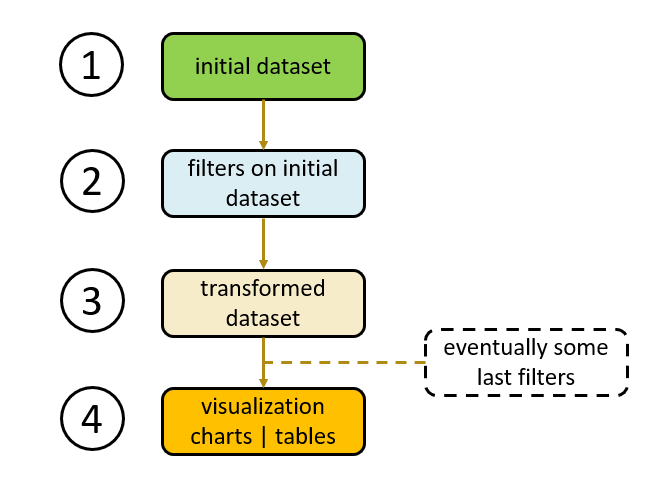
We will see that very often the workflow to create charts or tables will be as below :
a 4 steps workflow :
step 1 : get data.
step 2 : filter data.
step 3 : transform data.
step 4 : to create the visual, for example a chart or a table.
- note : this last step could also be used to create a data frame, or a reactive object (more about this when we go through the part related to the creation of shiny web apps).
The steps 1 to 3 aim to generate a data frame which will be used to create several different charts or tables.
This approach allows to keep our code simple :
limit the number of objects that we create, especially if we create a data frame which will be used to create different charts or tables.
facilitate the maintenance or update of the codes.
- reusing the data frame generated during the first 3 steps.
17 Data frame structure
17.1 2 variables
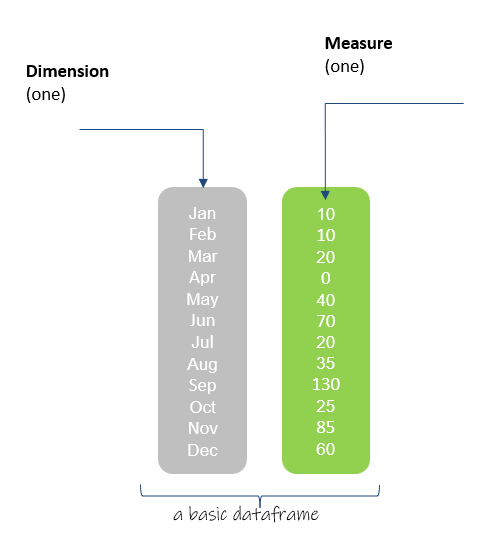
To create a very simple chart, for example a line chart or a bar chart, we need at least 2 variables :
a dimension.
a measure.
The dimension is usually the x axis. The measure is the y axis.
In order to create those charts, we may have to transform the initial data frame to reach this format , where one variable is either a dimension or a measure.
It’s the purpose of the steps 1 & 2 or 1 to 3 that we described above.
The figure below presents the most simple structure :
just 2 variables.
one dimension (the months of a year) and one measure (some sales quantities for example).
17.2 Multi-variables structure
We also can have a data frame with more variables :
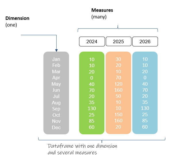
several measures.
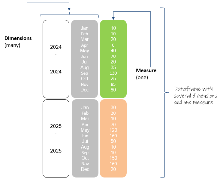
or several dimensions.
or several measures and dimensions.
Let’s look at the 2 following illustrations :
17.2.1 several measures
This data frame contains :
one dimension : the months of a year.
3 variables of measures : the (monthly) sales quantities of each calendar year.
17.2.2 several dimensions
We also could have :
several dimensions : calendar year and the months of a year.
one measure : the (monthly) sales quantities of each calendar year.
18 Syntax to create a chart
The example below is related to the library highcharter. However, most of the libraries (ggplot2, plotly,…) have a very similar approach.
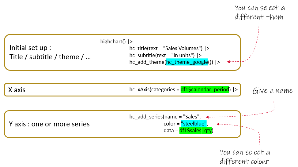
There are 3 parts, that you can write in a different order :
part 1 : the initial set up, it’s about the title / subtitle / theme / …
part 2 : the x axis.
part 3 : the y axis.
In the example below (highcharter), we also see how to :
change a theme, i.e. the background of a chart
- for example : the economist, google, 538,…
affect a color to a serie
for example, simply writing : steelblue, gold, mediumseagreen, salmon…
you can also use the RGB code or the HEX code of a color.
You can find all the color names, RGB or HEX codes on internet, for example for a green color : https://www.rapidtables.com/web/color/green-color.html
In the next section, we will see how to create some classic charts using the library highcharter.
19 R Color Brewer Package
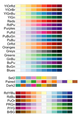
Let’s introduce briefly here the R package RColorBrewer.
This package contains some ready-to-use color palettes for creating beautiful graphics.
It’s very handy because we don’t have to define the colors of each serie.
The colors will be affected automatically, based on the palette we choose.
You can learn more here .
We will use this package in the next examples.