# ETL
library(tidyverse)
library(sparkline)

# Tables
library(reactable)
library(reactablefmtr)

# Others
library(htmltools) # to render some special html 21 reactable
The reactable table offers a lot of features and is very easy to use.
We’re going to build a classic way to look at the sales performance :
Display of sales between 2 similar periods YTD (Year To Date) and LYTD (Last Year To Date).
Comparison of YTD vs LYTD sales.
For this, we create first a table with the following features (i.e. variables) :
YTD total sum.
LYTD total sum.
YTD vs LYTD comparison, in value and in percentage.
And then we will add a sparkline, displaying per product the historical sales per month.
The purpose is to provide a quick picture of the sales pattern, inside the table. Always convenient to identify a trend, a seasonality, or some outliers.
We will then transform this data frame into a reactable to get a nice display of the results.
About the YTD vs LYTD concept :
we consider 2 consecutive years.
we compare a similar period of time during those 2 years.
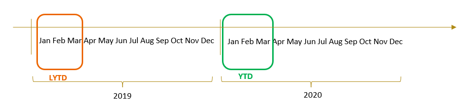
As usual, let’s start by uploading the libraries we will use : tidyverse for the ETL, sparkline to create sparklines (of course!), the 2 libraries reactable and reactablefmtr for the tables, and also the library htmltools.
22 Get and Tidy demo data frame
We’ll practice using a simple demo data frame :
18 products : different types of honey.
historical sales per month over 4 years : from 2016 until 2019.
Let’s upload and tidy our data frame to practice. After the ETL, we will get 6 variables :
5 dimensions :
1 sku_description : the different types of honey.
4 attributes of time : period, calendar_year, calendar_month, calendar_month_abb.
1 measure : sales_qty.
# Upload data frame

# Define the URL of the raw CSV file
url <- "https://raw.githubusercontent.com/nguyennico/table_practice/main/Sales_data.csv"

# Read the CSV file from the URL
df1 <- read.csv(url)


# pivot
df1 <- df1 |> gather(key = "period",
                     value = "sales_qty",
                     2:length(df1))

# remove the "X" in front of the period
df1$period <- gsub("X", "",df1$period)

# Format Date
df1$period <- as.Date(df1$period, format = '%m.%d.%Y')

# add the Calendar Year
df1$calendar_year <- year(df1$period)

# add the Calendar.Month
df1$calendar_month <- month(df1$period)


# Add calendar_month_abb
df1$calendar_month_abb <- month.abb[df1$calendar_month]


# create a factor
df1$calendar_month_abb <- factor(df1$calendar_month_abb,
                                 levels = c("Jan","Feb","Mar","Apr","May","Jun",
                                            "Jul","Aug","Sep", "Oct", "Nov", "Dec"))


# Get Results
Set_Up_Sales_data <- df1


glimpse(df1)
Rows: 648
Columns: 6
$ sku_description <chr> "Manuka_250gr", "Manuka_500gr", "Manuka_1000gr", "F…
$ period <date> 2016-10-01, 2016-10-01, 2016-10-01, 2016-10-01, 20…
$ sales_qty <int> 0, 0, 387, 78, 317, 126, 179, 95, 1325, 184, 124, 1…
$ calendar_year <dbl> 2016, 2016, 2016, 2016, 2016, 2016, 2016, 2016, 201…
$ calendar_month <dbl> 10, 10, 10, 10, 10, 10, 10, 10, 10, 10, 10, 10, 10,…
$ calendar_month_abb <fct> Oct, Oct, Oct, Oct, Oct, Oct, Oct, Oct, Oct, Oct, O…23 Create YTD vs LYTD
Now let’s create a YTD vs LYTD table.
Note that to create it, we follow the classic methodology we discussed in the previous chapters :
1) Get data => 2) Filter => 3) Transform => 4) Visualize : table .
it’s a similar approach with the creation of charts.
#----------------------
# Get Data
#----------------------

# set working df
df1 <- Set_Up_Sales_data


#----------------------
# Filter
#----------------------


# filter on Calendar Year
df1 <- df1 |> filter(calendar_year %in% c(2018,2019))


# filter on YTD Calendar Month
df1 <- df1 |> filter(calendar_month <= 9)


#----------------------
# Transform
#----------------------

# Aggregate
df1 <- df1 |> group_by(sku_description, calendar_year) |>
    summarize(sales_qty = sum(sales_qty)
              )
`summarise()` has regrouped the output.
ℹ Summaries were computed grouped by sku_description and calendar_year.
ℹ Output is grouped by sku_description.
ℹ Use `summarise(.groups = "drop_last")` to silence this message.
ℹ Use `summarise(.by = c(sku_description, calendar_year))` for per-operation
grouping (`?dplyr::dplyr_by`) instead.# Spread Value
df1 <- df1 |> spread(calendar_year, sales_qty)
# replace missing values (NA) by zero
df1[is.na(df1)] <- 0
# calculate differences
df1$delta_value <- df1$`2019`-df1$`2018`
df1$delta_value_pc <- df1$delta_value / df1$`2018`
# calculate percentage of YTD Net Sales
df1$YTD_value_pc <- df1$`2019` / sum(df1$`2019`)
# Rename columns
df1 <- df1 |> rename(
YTD_value= `2019`,
LYTD_value = `2018`
)
# replace -inf by zero
df1$delta_value_pc <- if_else(is.infinite(df1$delta_value_pc),
0,
df1$delta_value_pc)
# replace missing by zero
df1$delta_value_pc <- df1$delta_value_pc |> replace_na(0)
# Get Results
ytd_vs_lytd_data <- df1
# display data frame
ytd_vs_lytd_data# A tibble: 18 × 6
# Groups: sku_description [18]
sku_description LYTD_value YTD_value delta_value delta_value_pc YTD_value_pc
<chr> <int> <int> <int> <dbl> <dbl>
1 Acacia_1000gr 6211 6070 -141 -0.0227 0.109
2 Acacia_250gr 95 0 -95 -1 0
3 Acacia_500gr 2485 2719 234 0.0942 0.0486
4 Flowers_1000gr 10019 8137 -1882 -0.188 0.146
5 Flowers_250gr 1708 1042 -666 -0.390 0.0186
6 Flowers_500gr 2893 3920 1027 0.355 0.0701
7 Forest_1000gr 2720 2894 174 0.0640 0.0518
8 Forest_250gr 940 807 -133 -0.141 0.0144
9 Forest_500gr 3117 2876 -241 -0.0773 0.0514
10 Manuka_1000gr 3460 3029 -431 -0.125 0.0542
11 Manuka_250gr 77 140 63 0.818 0.00250
12 Manuka_500gr 508 907 399 0.785 0.0162
13 Mountains_1000gr 13422 13247 -175 -0.0130 0.237
14 Mountains_250gr 795 1063 268 0.337 0.0190
15 Mountains_500gr 927 946 19 0.0205 0.0169
16 Spring_1000gr 2156 1310 -846 -0.392 0.0234
17 Spring_250gr 1947 2145 198 0.102 0.0384
18 Spring_500gr 4120 4667 547 0.133 0.0835 Now, let’s visualize the data frame ytd_vs_lytd_data using the reactable library.
24 Create Reactable
24.1 simple reactable
To transform quickly our data frame into a reactable, we can just type reactable(the name of the dataframe) :
# set a working df
df1 <- ytd_vs_lytd_data

#----------------------
# Table
#----------------------

reactable(df1)
We get a very simple table :
we can feel the design, light and clear, of a
reactable.however the columns are a bit “raw”, not formatted yet.
Then, let’s look at more functionnalities to give a better appearance to our table.
24.2 sorting table
The previous table was very simple.
Now, let’s add a few more features :
a more compact table : adding the feature
compact = TRUE.sorting by descending YTD_value, mentioning 2 elements :
defaultSortOrder = "desc": to indicate the direction (descending or by default ascending).defaultSorted = c("name of the variable"): to indicate the variable we use to sort the table.
formatting the variable [sku_description] : giving it a new name and defining the column width.
To format or work on the different variables we will :
name them inside the code
columns = list(...).start with the name of the variable in the data frame, followed by
= colDef().- then, inside the
colDef(), we will specify different features, such as : a new name, the desired width of the column or some conditional formatting.
- then, inside the
# set a working df
df1 <- ytd_vs_lytd_data

# create reactable
reactable(df1, compact = TRUE,


          defaultSortOrder = "desc",
          defaultSorted = c("YTD_value"),

          columns = list(

            sku_description = colDef(name = "Product",
                                     minWidth = 170)

            ) # close columns list


          ) # close reactable
24.3 basic columns formatting
The table looks already a bit nicer. Now, let’s add some variables formatting :
[YTD_value] : formatting of thousands unit, and a yellow color, also adding a sum, aggregating the values of all the rows.
[LYTD_value] : formatting of thousands unit.
- same code with [YTD_value], but without the style part.
[YTD_value_pc] : formatting as percentage.
Note :
the parts of code to format each variable end with a comma, except the last part.
we also add at the end the line
defaultColDef = colDef(footerStyle = list(fontWeight = "bold")).- this will format the total sum of each column as bold.
# set a working df
df1 <- ytd_vs_lytd_data

# create reactable
reactable(df1, compact = TRUE,


          defaultSortOrder = "desc",
          defaultSorted = c("YTD_value"),

          columns = list(

            sku_description = colDef(
              name = "Product",
              minWidth = 170),


            YTD_value = colDef(
              name = "YTD (units)",
              aggregate = "sum",
              footer = function(values) formatC(sum(values),
                                                format = "f",
                                                big.mark = ",",
                                                digits = 0),
              format = colFormat(separators = TRUE,
                                 digits = 0),
              style = list(background = "yellow",
                           fontWeight = "bold")
              ),


            LYTD_value = colDef(
              name = "LYTD (units)",
              aggregate = "sum",
              footer = function(values) formatC(sum(values),
                                                format = "f",
                                                big.mark = ",",
                                                digits = 0),
              format = colFormat(separators = TRUE,
                                 digits = 0)

              ),


            YTD_value_pc = colDef(
              name = "share of YTD Volume (%)",
              format = colFormat(percent = TRUE, digits = 1)
              )


            ), # close columns list


          defaultColDef = colDef(footerStyle = list(fontWeight = "bold"))

          ) # close reactable
We now have formatted 3 additional variables in our reactable, and it looks even nicer.
Let’s add more formatting.
24.4 conditional formatting
Now, let’s work on the 2 variables [delta_value] and [delta_value_pc]. Some of those values are positive and negative.
We will format them based on those signs. For this, we simply introduce an if then else condition with colors, to the previous syntax, creating a function.
We add the syntax style = function(value){ details about the function} inside the colDef() part.
Notes :
We will learn about the functions in a dedicated chapter. For the time being we will just create and use one in this example, to show how to format further our table.
The objective is to show how to format, and to reuse this code when we need it.
# set a working df
df1 <- ytd_vs_lytd_data

# create reactable
reactable(df1, compact = TRUE,


          defaultSortOrder = "desc",
          defaultSorted = c("YTD_value"),

          columns = list(

            sku_description = colDef(
              name = "Product",
              minWidth = 170),


            YTD_value = colDef(
              name = "YTD (units)",
              aggregate = "sum",
              footer = function(values) formatC(sum(values),
                                                format = "f",
                                                big.mark = ",",
                                                digits = 0),
              format = colFormat(separators = TRUE,
                                 digits = 0),
              style = list(background = "yellow",
                           fontWeight = "bold")
              ),


            LYTD_value = colDef(
              name = "LYTD (units)",
              aggregate = "sum",
              footer = function(values) formatC(sum(values),
                                                format = "f",
                                                big.mark = ",",
                                                digits = 0),
              format = colFormat(separators = TRUE,
                                 digits = 0)

              ),


            YTD_value_pc = colDef(
              name = "share of YTD Volume (%)",
              format = colFormat(percent = TRUE, digits = 1)
              ),


            delta_value = colDef(
              name = "YTD vs LYTD (units)",
              aggregate = "sum",
              footer = function(values) formatC(sum(values),
                                                format = "f",
                                                big.mark = ",",
                                                digits = 0),
              format = colFormat(separators = TRUE,
                                 digits = 0),

              style = function(value) {
                if (value > 0) {
                  color <- "#008000"
                  } else if (value < 0) {
                    color <- "#e00000"
                    } else {
                      color <- "#777"
                      }
                list(color = color, fontWeight = "bold")
                }
              ),


            delta_value_pc = colDef(
              name = "YTD vs LYTD volumes (%)",
              format = colFormat(percent = TRUE, digits = 1),

              style = function(value) {
                if (value > 0) {
                  color <- "#008000"
                  } else if (value < 0) {
                    color <- "#e00000"
                    } else {
                      color <- "#777"
                      }
                list(color = color, fontWeight = "bold")
                }
              )


            ), # close columns list

          defaultColDef = colDef(footerStyle = list(fontWeight = "bold"))

          ) # close reactable
The table is now pretty easy to read !
Hey…we still can improve the visual, adding some negative and positive bars in the column YTD_value_pc .
25 Additional features
25.1 Bar positive & negative values
Let’s create a function bar_chart_pos_neg(), using the library htmltools . This function will generate a dual bars visual, with 2 colors (here red and green) to better see the percentage variations.
# Render a bar chart with positive and negative values
bar_chart_pos_neg <- function(label, value, max_value = 1, height = "16px",
                              pos_fill = "#32CD32", neg_fill = "#dc3220") {
  neg_chart <- div(style = list(flex = "1 1 0"))
  pos_chart <- div(style = list(flex = "1 1 0"))
  width <- paste0(abs(value / max_value) * 100, "%")

  if (value < 0) {
    bar <- div(style = list(marginLeft = "8px", background = neg_fill, width = width, height = height))
    chart <- div(style = list(display = "flex", alignItems = "center", justifyContent = "flex-end"), label, bar)
    neg_chart <- tagAppendChild(neg_chart, chart)
  } else {
    bar <- div(style = list(marginRight = "8px", background = pos_fill, width = width, height = height))
    chart <- div(style = list(display = "flex", alignItems = "center"), bar, label)
    pos_chart <- tagAppendChild(pos_chart, chart)
  }

  div(style = list(display = "flex"), neg_chart, pos_chart)
}
Now let’s create the reactable using this new function bar_chart_pos_neg() within the attribute cell(), for the variable delta_value_pc.
# set a working df
df1 <- ytd_vs_lytd_data

# create reactable
reactable(df1, compact = TRUE,


          defaultSortOrder = "desc",
          defaultSorted = c("YTD_value"),

          columns = list(

            sku_description = colDef(
              name = "Product",
              minWidth = 170),


            YTD_value = colDef(
              name = "YTD (units)",
              aggregate = "sum",
              footer = function(values) formatC(sum(values),
                                                format = "f",
                                                big.mark = ",",
                                                digits = 0),
              format = colFormat(separators = TRUE,
                                 digits = 0),
              style = list(background = "yellow",
                           fontWeight = "bold")
              ),


            LYTD_value = colDef(
              name = "LYTD (units)",
              aggregate = "sum",
              footer = function(values) formatC(sum(values),
                                                format = "f",
                                                big.mark = ",",
                                                digits = 0),
              format = colFormat(separators = TRUE,
                                 digits = 0)

              ),


            YTD_value_pc = colDef(
              name = "share of YTD Volume (%)",
              format = colFormat(percent = TRUE, digits = 1)
              ),


            delta_value = colDef(
              name = "YTD vs LYTD (units)",
              aggregate = "sum",
              footer = function(values) formatC(sum(values),
                                                format = "f",
                                                big.mark = ",",
                                                digits = 0),
              format = colFormat(separators = TRUE,
                                 digits = 0),

              style = function(value) {
                if (value > 0) {
                  color <- "#008000"
                  } else if (value < 0) {
                    color <- "#e00000"
                    } else {
                      color <- "#777"
                      }
                list(color = color, fontWeight = "bold")
                }
              ),


            #------------------
            # new part

            delta_value_pc = colDef(
              name = "YTD vs LYTD volumes (%)",
              format = colFormat(percent = TRUE, digits = 1),


              cell = function(value) {
                label <- paste0(round(value * 100), "%")
                bar_chart_pos_neg(label, value)
                },
              align = "center",
              minWidth = 400
              )


            #------------------


            ), # close columns list

          defaultColDef = colDef(footerStyle = list(fontWeight = "bold"))

          ) # close reactable
It’s getting nice!
With the colors, the table is becoming very easy to read. Let’s continue adding more features to it.
25.2 Add monthly sales Sparklines
Now we’re going to :
create a 2nd data frame, with a list of values to generate a sparkline.
- In this example, we will look at the whole horizon of time, displaying the monthly sales per product.
Once the 2nd data frame, called sparkline_data, is created, we will add it to the 1st data frame ytd_vs_lytd_data, using the function
left_join().
Then we will have in the final data frame a new variable called “quantity”, which is a list (of monthly sales values).
25.2.1 create monthly sparklines
#----------------------
# Create Sparklines
#----------------------

# set a working df
df1 <- Set_Up_Sales_data

# aggregate
df1 <- df1 |> group_by(sku_description, period) |>
      summarise(quantity = sum(sales_qty)
                )

# create list
df1 <- df1 |> group_by(sku_description) |>
      summarise(quantity = list(quantity))

# keep results
sparkline_data <- df1


#----------------------
# Link dataframes
#----------------------

# merge
df1 <- left_join(ytd_vs_lytd_data, sparkline_data)

glimpse(df1)
Rows: 18
Columns: 7
Groups: sku_description [18]
$ sku_description <chr> "Acacia_1000gr", "Acacia_250gr", "Acacia_500gr", "Flow…
$ LYTD_value <int> 6211, 95, 2485, 10019, 1708, 2893, 2720, 940, 3117, 34…
$ YTD_value <int> 6070, 0, 2719, 8137, 1042, 3920, 2894, 807, 2876, 3029…
$ delta_value <int> -141, -95, 234, -1882, -666, 1027, 174, -133, -241, -4…
$ delta_value_pc <dbl> -0.02270166, -1.00000000, 0.09416499, -0.18784310, -0.…
$ YTD_value_pc <dbl> 0.108549867, 0.000000000, 0.048623902, 0.145514047, 0.…
$ quantity <list> <765, 927, 1412, 717, 800, 906, 596, 713, 642, 695, 5…25.2.2 display reactable
Now let’s add the sparkline part to the previous reactable :
- within the
cell()function, we add the syntax :sparkline(df1$quantity[[index]]). - using the function
sparkline()on the variable quantity, which is a list.
# create reactable
reactable(df1, compact = TRUE,


          defaultSortOrder = "desc",
          defaultSorted = c("YTD_value"),

          columns = list(

            sku_description = colDef(
              name = "Product",
              minWidth = 170),


            YTD_value = colDef(
              name = "YTD (units)",
              aggregate = "sum",
              footer = function(values) formatC(sum(values),
                                                format = "f",
                                                big.mark = ",",
                                                digits = 0),
              format = colFormat(separators = TRUE,
                                 digits = 0),
              style = list(background = "yellow",
                           fontWeight = "bold")
              ),


            LYTD_value = colDef(
              name = "LYTD (units)",
              aggregate = "sum",
              footer = function(values) formatC(sum(values),
                                                format = "f",
                                                big.mark = ",",
                                                digits = 0),
              format = colFormat(separators = TRUE,
                                 digits = 0)

              ),


            YTD_value_pc = colDef(
              name = "share of YTD Volume (%)",
              format = colFormat(percent = TRUE, digits = 1)
              ),


            delta_value = colDef(
              name = "YTD vs LYTD (units)",
              aggregate = "sum",
              footer = function(values) formatC(sum(values),
                                                format = "f",
                                                big.mark = ",",
                                                digits = 0),
              format = colFormat(separators = TRUE,
                                 digits = 0),

              style = function(value) {
                if (value > 0) {
                  color <- "#008000"
                  } else if (value < 0) {
                    color <- "#e00000"
                    } else {
                      color <- "#777"
                      }
                list(color = color, fontWeight = "bold")
                }
              ),


            delta_value_pc = colDef(
              name = "YTD vs LYTD volumes (%)",
              format = colFormat(percent = TRUE, digits = 1),


              cell = function(value) {
                label <- paste0(round(value * 100), "%")
                bar_chart_pos_neg(label, value)
                },
              align = "center",
              minWidth = 400
              ),


            #------------------
            # new part

            quantity = colDef(
              name = "Monthly Sales",
              cell = function(value, index) {
                sparkline(df1$quantity[[index]])
                })


            #------------------


            ), # close columns list

          defaultColDef = colDef(footerStyle = list(fontWeight = "bold"))

          ) # close reactable
The new table provides some quick visual insights on top of the YTD vs LYTD comparison:
previous features.
main (YTD vs LYTD) variations.
understanding of the “weight” of each SKU (in terms of sales volumes).
and a new one : sales trend / seasonality.
- useful to identify some outliers and visualize the sales pattern and direction.
Putting this in the context of Sales analysis, we can change the Dimension, displaying for example some customers or groups of customers, sales channels, etc.
25.3 Add MTM Sparkline
We can create another perspective of sparkline :
to compare the monthly variations (month to month -MTM- ) between fiscal years.
so we can understand which months in the YTD period are higher or lower than the ones in the LYTD period.
First, we’re going to calculate the difference between similar months (Jan, Feb, Mar,…) of 2 different years (here 2019 vs 2018). We will call this variable monthly_variation.
Then we will transform those monthly values into a list, and keep the result into a new data frame called MTM_sparkline_data .
25.3.1 create MTM sparklines
# set a working df
df1 <- Set_Up_Sales_data

#----------------------
# Filter
#----------------------


# filter on Calendar Year
df1 <- df1 |> filter(calendar_year %in% c(2018,2019))


# filter on YTD Calendar Month
df1 <- df1 |> filter(calendar_month <= 9)


# filter on

# aggregate
df1 <- df1 |> group_by(sku_description, calendar_month_abb, calendar_year) |>
      summarise(sales_qty = sum(sales_qty)
                )


# spread
df1 <- df1 |> spread(calendar_year, sales_qty)

# replace missing values by 0
df1$`2019` <- df1$`2019` |> replace_na(0)
df1$`2018` <- df1$`2018` |> replace_na(0)

# calculate MTM difference
df1$monthly_variation <- df1$`2019` - df1$`2018`


# aggregate
df1 <- df1 |> group_by(sku_description, calendar_month_abb) |>
      summarise(monthly_variation = sum(monthly_variation)
                )

# generate list
df1 <- df1 |> group_by(sku_description) |>
      summarise(monthly_variation = list(monthly_variation)
                )


# keep results
MTM_sparkline_data <- df1


glimpse(MTM_sparkline_data)
Rows: 18
Columns: 2
$ sku_description <chr> "Acacia_1000gr", "Acacia_250gr", "Acacia_500gr", "Fl…
$ monthly_variation <list> <102, -36, 128, 11, 147, -67, 84, -6, -504>, <-11, …Now we can add this 3rd data frame MTM_sparkline_data to the 2 other ones, using the function left_join() :
# merge
df1 <- left_join(ytd_vs_lytd_data, MTM_sparkline_data)
df1 <- left_join(df1, sparkline_data)

glimpse(df1)
Rows: 18
Columns: 8
Groups: sku_description [18]
$ sku_description <chr> "Acacia_1000gr", "Acacia_250gr", "Acacia_500gr", "Fl…
$ LYTD_value <int> 6211, 95, 2485, 10019, 1708, 2893, 2720, 940, 3117, …
$ YTD_value <int> 6070, 0, 2719, 8137, 1042, 3920, 2894, 807, 2876, 30…
$ delta_value <int> -141, -95, 234, -1882, -666, 1027, 174, -133, -241, …
$ delta_value_pc <dbl> -0.02270166, -1.00000000, 0.09416499, -0.18784310, -…
$ YTD_value_pc <dbl> 0.108549867, 0.000000000, 0.048623902, 0.145514047, …
$ monthly_variation <list> <102, -36, 128, 11, 147, -67, 84, -6, -504>, <-11, …
$ quantity <list> <765, 927, 1412, 717, 800, 906, 596, 713, 642, 695,…25.3.2 display reactable
Finally, we can display the sparkline inside the reactable.
the variable monthly_variation will still use the function
sparkline()as we did previously.the syntax is slightly different :
we don’t mention any index.
we inform the attribute
type = bar, to display a bar chart.
# create reactable
reactable(df1, compact = TRUE,


          defaultSortOrder = "desc",
          defaultSorted = c("YTD_value"),

          columns = list(

            sku_description = colDef(
              name = "Product",
              minWidth = 170),


            YTD_value = colDef(
              name = "YTD (units)",
              aggregate = "sum",
              footer = function(values) formatC(sum(values),
                                                format = "f",
                                                big.mark = ",",
                                                digits = 0),
              format = colFormat(separators = TRUE,
                                 digits = 0),
              style = list(background = "yellow",
                           fontWeight = "bold")
              ),


            LYTD_value = colDef(
              name = "LYTD (units)",
              aggregate = "sum",
              footer = function(values) formatC(sum(values),
                                                format = "f",
                                                big.mark = ",",
                                                digits = 0),
              format = colFormat(separators = TRUE,
                                 digits = 0)

              ),


            YTD_value_pc = colDef(
              name = "share of YTD Volume (%)",
              format = colFormat(percent = TRUE, digits = 1)
              ),


            delta_value = colDef(
              name = "YTD vs LYTD (units)",
              aggregate = "sum",
              footer = function(values) formatC(sum(values),
                                                format = "f",
                                                big.mark = ",",
                                                digits = 0),
              format = colFormat(separators = TRUE,
                                 digits = 0),

              style = function(value) {
                if (value > 0) {
                  color <- "#008000"
                  } else if (value < 0) {
                    color <- "#e00000"
                    } else {
                      color <- "#777"
                      }
                list(color = color, fontWeight = "bold")
                }
              ),


            delta_value_pc = colDef(
              name = "YTD vs LYTD volumes (%)",
              format = colFormat(percent = TRUE, digits = 1),


              cell = function(value) {
                label <- paste0(round(value * 100), "%")
                bar_chart_pos_neg(label, value)
                },
              align = "center",
              minWidth = 400
              ),


            quantity = colDef(
              name = "Monthly Sales",
              cell = function(value, index) {
                sparkline(df1$quantity[[index]])
                }),


            #------------------
            # new part

            monthly_variation = colDef(
              name = "MTM Variations",
              cell = function(values) {
                sparkline(values, type = "bar")
                  })


            #------------------


            ), # close columns list

          defaultColDef = colDef(footerStyle = list(fontWeight = "bold"))

          ) # close reactable
Hey…the table is really getting insightful!
We can quickly see which months are lower or higher than the same ones, one year ago.
25.4 Add column groups
Let’s continue with the previous table, and group a few columns :
YTD_value.
LYTD_value.
delta_value.
delta_value_pc.
Those 4 variables are related to the measures and comparison of a YTD vs LYTD volumes, and could be gathered into a common group. We’ll name this group YTD vs LYTD.
For this, at the end of the reactable we add a few lines :
a function
columnGroups()equals to a list which contains one or severalcolGroup()functions.a
colGroup()function :has a name.
indicates the columns it gathers, using the syntax :
columns = c("variable1", "variable2").
There is one colGroup() function for each group we aim to create.
# create reactable
reactable(df1, compact = TRUE,


          defaultSortOrder = "desc",
          defaultSorted = c("YTD_value"),

          columns = list(

            sku_description = colDef(
              name = "Product",
              minWidth = 170),


            YTD_value = colDef(
              name = "YTD (units)",
              aggregate = "sum",
              footer = function(values) formatC(sum(values),
                                                format = "f",
                                                big.mark = ",",
                                                digits = 0),
              format = colFormat(separators = TRUE,
                                 digits = 0),
              style = list(background = "yellow",
                           fontWeight = "bold")
              ),


            LYTD_value = colDef(
              name = "LYTD (units)",
              aggregate = "sum",
              footer = function(values) formatC(sum(values),
                                                format = "f",
                                                big.mark = ",",
                                                digits = 0),
              format = colFormat(separators = TRUE,
                                 digits = 0)

              ),


            YTD_value_pc = colDef(
              name = "share of YTD Volume (%)",
              format = colFormat(percent = TRUE, digits = 1)
              ),


            delta_value = colDef(
              name = "YTD vs LYTD (units)",
              aggregate = "sum",
              footer = function(values) formatC(sum(values),
                                                format = "f",
                                                big.mark = ",",
                                                digits = 0),
              format = colFormat(separators = TRUE,
                                 digits = 0),

              style = function(value) {
                if (value > 0) {
                  color <- "#008000"
                  } else if (value < 0) {
                    color <- "#e00000"
                    } else {
                      color <- "#777"
                      }
                list(color = color, fontWeight = "bold")
                }
              ),


            delta_value_pc = colDef(
              name = "YTD vs LYTD volumes (%)",
              format = colFormat(percent = TRUE, digits = 1),


              cell = function(value) {
                label <- paste0(round(value * 100), "%")
                bar_chart_pos_neg(label, value)
                },
              align = "center",
              minWidth = 400
              ),


            quantity = colDef(
              name = "Monthly Sales",
              cell = function(value, index) {
                sparkline(df1$quantity[[index]])
                }),


            #------------------
            # new part

            monthly_variation = colDef(
              name = "MTM Variations",
              cell = function(values) {
                sparkline(values, type = "bar")
                  })


            #------------------


            ), # close columns list

          defaultColDef = colDef(footerStyle = list(fontWeight = "bold")),

          columnGroups = list(

                colGroup(name = "YTD vs LYTD",
                         columns = c("YTD_value",
                                     "LYTD_value",
                                     "delta_value",
                                     "delta_value_pc")
                         )

              )

          ) # close reactable
We now have :
a header on top of the columns that we have grouped.
an horizontal line above those columns.
This makes the table more readable in some situations where we have several columns.
25.5 Sticky columns
We also can freeze some columns, to make the navigation easier. For this, we write the syntax sticky = "left" inside the colDef() of the variable we want to freeze.
Here, let’s freeze the first variable sku_description.
# create reactable
reactable(df1, compact = TRUE,


          defaultSortOrder = "desc",
          defaultSorted = c("YTD_value"),

          columns = list(

            sku_description = colDef(
              name = "Product",
              minWidth = 170,
              sticky = "left"),


            YTD_value = colDef(
              name = "YTD (units)",
              aggregate = "sum",
              footer = function(values) formatC(sum(values),
                                                format = "f",
                                                big.mark = ",",
                                                digits = 0),
              format = colFormat(separators = TRUE,
                                 digits = 0),
              style = list(background = "yellow",
                           fontWeight = "bold")
              ),


            LYTD_value = colDef(
              name = "LYTD (units)",
              aggregate = "sum",
              footer = function(values) formatC(sum(values),
                                                format = "f",
                                                big.mark = ",",
                                                digits = 0),
              format = colFormat(separators = TRUE,
                                 digits = 0)

              ),


            YTD_value_pc = colDef(
              name = "share of YTD Volume (%)",
              format = colFormat(percent = TRUE, digits = 1)
              ),


            delta_value = colDef(
              name = "YTD vs LYTD (units)",
              aggregate = "sum",
              footer = function(values) formatC(sum(values),
                                                format = "f",
                                                big.mark = ",",
                                                digits = 0),
              format = colFormat(separators = TRUE,
                                 digits = 0),

              style = function(value) {
                if (value > 0) {
                  color <- "#008000"
                  } else if (value < 0) {
                    color <- "#e00000"
                    } else {
                      color <- "#777"
                      }
                list(color = color, fontWeight = "bold")
                }
              ),


            delta_value_pc = colDef(
              name = "YTD vs LYTD volumes (%)",
              format = colFormat(percent = TRUE, digits = 1),


              cell = function(value) {
                label <- paste0(round(value * 100), "%")
                bar_chart_pos_neg(label, value)
                },
              align = "center",
              minWidth = 400
              ),


            quantity = colDef(
              name = "Monthly Sales",
              cell = function(value, index) {
                sparkline(df1$quantity[[index]])
                }),


            #------------------
            # new part

            monthly_variation = colDef(
              name = "MTM Variations",
              cell = function(values) {
                sparkline(values, type = "bar")
                  })


            #------------------


            ), # close columns list

          defaultColDef = colDef(footerStyle = list(fontWeight = "bold"))

          ) # close reactable
If we want to freeze several variables, we just need to write the syntax sticky = "left" inside the colDef() of each variable we want to freeze.
Let’s say we want to freeze the first 3 variables sku_description | YTD_value | LYTD_value, we will write :
# create reactable
reactable(df1, compact = TRUE,


          defaultSortOrder = "desc",
          defaultSorted = c("YTD_value"),

          columns = list(

            sku_description = colDef(
              name = "Product",
              minWidth = 170,
              sticky = "left"),


            YTD_value = colDef(
              name = "YTD (units)",
              sticky = "left",
              aggregate = "sum",
              footer = function(values) formatC(sum(values),
                                                format = "f",
                                                big.mark = ",",
                                                digits = 0),
              format = colFormat(separators = TRUE,
                                 digits = 0),
              style = list(background = "yellow",
                           fontWeight = "bold")
              ),


            LYTD_value = colDef(
              name = "LYTD (units)",
              sticky = "left",
              aggregate = "sum",
              footer = function(values) formatC(sum(values),
                                                format = "f",
                                                big.mark = ",",
                                                digits = 0),
              format = colFormat(separators = TRUE,
                                 digits = 0)

              ),


            YTD_value_pc = colDef(
              name = "share of YTD Volume (%)",
              format = colFormat(percent = TRUE, digits = 1)
              ),


            delta_value = colDef(
              name = "YTD vs LYTD (units)",
              aggregate = "sum",
              footer = function(values) formatC(sum(values),
                                                format = "f",
                                                big.mark = ",",
                                                digits = 0),
              format = colFormat(separators = TRUE,
                                 digits = 0),

              style = function(value) {
                if (value > 0) {
                  color <- "#008000"
                  } else if (value < 0) {
                    color <- "#e00000"
                    } else {
                      color <- "#777"
                      }
                list(color = color, fontWeight = "bold")
                }
              ),


            delta_value_pc = colDef(
              name = "YTD vs LYTD volumes (%)",
              format = colFormat(percent = TRUE, digits = 1),


              cell = function(value) {
                label <- paste0(round(value * 100), "%")
                bar_chart_pos_neg(label, value)
                },
              align = "center",
              minWidth = 400
              ),


            quantity = colDef(
              name = "Monthly Sales",
              cell = function(value, index) {
                sparkline(df1$quantity[[index]])
                }),


            #------------------
            # new part

            monthly_variation = colDef(
              name = "MTM Variations",
              cell = function(values) {
                sparkline(values, type = "bar")
                  })


            #------------------


            ), # close columns list

          defaultColDef = colDef(footerStyle = list(fontWeight = "bold"))

          ) # close reactable
26 More formatting on reactable
2 very classic ways to highlight some values in a table are :
conditional formatting.
heatmap.
First, we’re going to see how to create a conditional formatting, for one column or multiple columns (which is especially useful when we have a table displayed as a wide format, and we would like to apply some conditional formatting on all the columns).
We will go through 2 examples showing how to format depending on :
one value.
two values.
Demo data frame
Let’s first create a simple demo data frame called coverage_data :
6 items : A, B, C, D, E.
5 Periods of time.
some values related to each item and Period of time.
# create vectors
Item <- c("A", "B", "C", "D", "E")

Period1 <- c(3, 4, 5, 2, 1)
Period2 <- c(1, 6, 3, 3, 10)
Period3 <- c(8, 2, 5, 4, 6)
Period4 <- c(5, 4, 6, 2, 7)
Period5 <- c(6, 9, 8, 1, 3)

# combine into a data frame
coverage_data <- data.frame(Item,
                   Period1,
                   Period2,
                   Period3,
                   Period4,
                   Period5)

# display
coverage_data
Item Period1 Period2 Period3 Period4 Period5
1 A 3 1 8 5 6
2 B 4 6 2 4 9
3 C 5 3 5 6 8
4 D 2 3 4 2 1
5 E 1 10 6 7 326.1 Conditional formatting
26.1.1 1 threshold
Let’s create a function highlight_cells(), which works as follow :
if a (cell) value is above a defined threshold, here 6 for example, then create a background in yellow.
otherwise, keep the initial value and no special background.
# Define a custom cell renderer to highlight values above 6
highlight_cells <- function(value) {
  if (value > 6) {
    return(htmltools::div(style = "background-color: yellow;", value))
  } else {
    return(value)
  }
}
Now let’s apply this function to each column of the data frame .
For this, we create a “for-each loop”, and apply this function to each column of the data frame coverage_data, except the first column.
Note :
in the example below we define first a value column_defs, with the first column as value.
- it’s a list with only one element.
then, using the “for-each loop”, we will create a value related the name of each column.
- we obtain a list with 6 elements.
# Create column definitions dynamically
column_defs <- list(Item = colDef(name = "Item Description"))

# Add the dynamic column definitions for the remaining columns
for (col in names(coverage_data)[-1]) {
  column_defs[[col]] <- colDef(cell = highlight_cells)
}
Now let’s visualize the reactable. We can affect the previous value column_defs to the columns.
The syntax is actually pretty simple ;
# Create the reactable table with custom cell rendering
reactable(
  coverage_data,
  columns = column_defs
)
The formatting is applied to all the columns of the table.
26.1.2 2 thresholds
Now, let’s highlight in yellow all the cells > 6, and in red the ones < 2.
As before, we start by creating a function. We will call it highlight_cells() .
# Define a custom cell renderer to highlight values
highlight_cells <- function(value) {
  if (value > 6) {
    return(htmltools::div(style = "background-color: yellow;", value))
  } else if (value < 2) {
    return(htmltools::div(style = "background-color: red;", value))
  } else {
    return(value)
  }
}
Let’s apply this function to the different columns of the data frame and keep the results as a list, called column_defs :
# Create column definitions dynamically
column_defs <- list(Item = colDef(name = "Item Description"))

# Add the dynamic column definitions for the remaining columns
for (col in names(coverage_data)[-1]) {
  column_defs[[col]] <- colDef(cell = highlight_cells)
}
Now let’s create the reactable :
# Create the reactable table with custom cell rendering
reactable(
  coverage_data,
  columns = column_defs
)
26.2 Heatmap
Creating a heatmap in a reactable is relatively easy. We just need to use the function color_scales() .
This function can be applied on :
defined columns (using their names) : having a dedicated scale of colors for each column.
or on several columns as a group (mentioning their position with the value
span).- applying in this case the same scale of colors for all the columns.
Looking at the 2 examples below, we can see the difference between the 2 approaches on the Period 1.
26.2.1 on defined columns
We apply the function color_scales() to each variable, affecting it to the style of the colDef() .
df1 <- coverage_data

reactable(
  df1,

  columns = list(

    Period1 = colDef(
      style = color_scales(df1)
    ),

    Period2 = colDef(
      style = color_scales(df1)
    )
  )
)
26.2.2 on several columns
In this case, we create a by default style, not linked to any variable.
The value span indicates the positions of the columns on which we aim to apply the function color_scales() .
# create a working df
df1 <- coverage_data

# create reactable
reactable(
  df1,
  defaultColDef = colDef(
    style = color_scales(df1, span = 2:6)
    ))